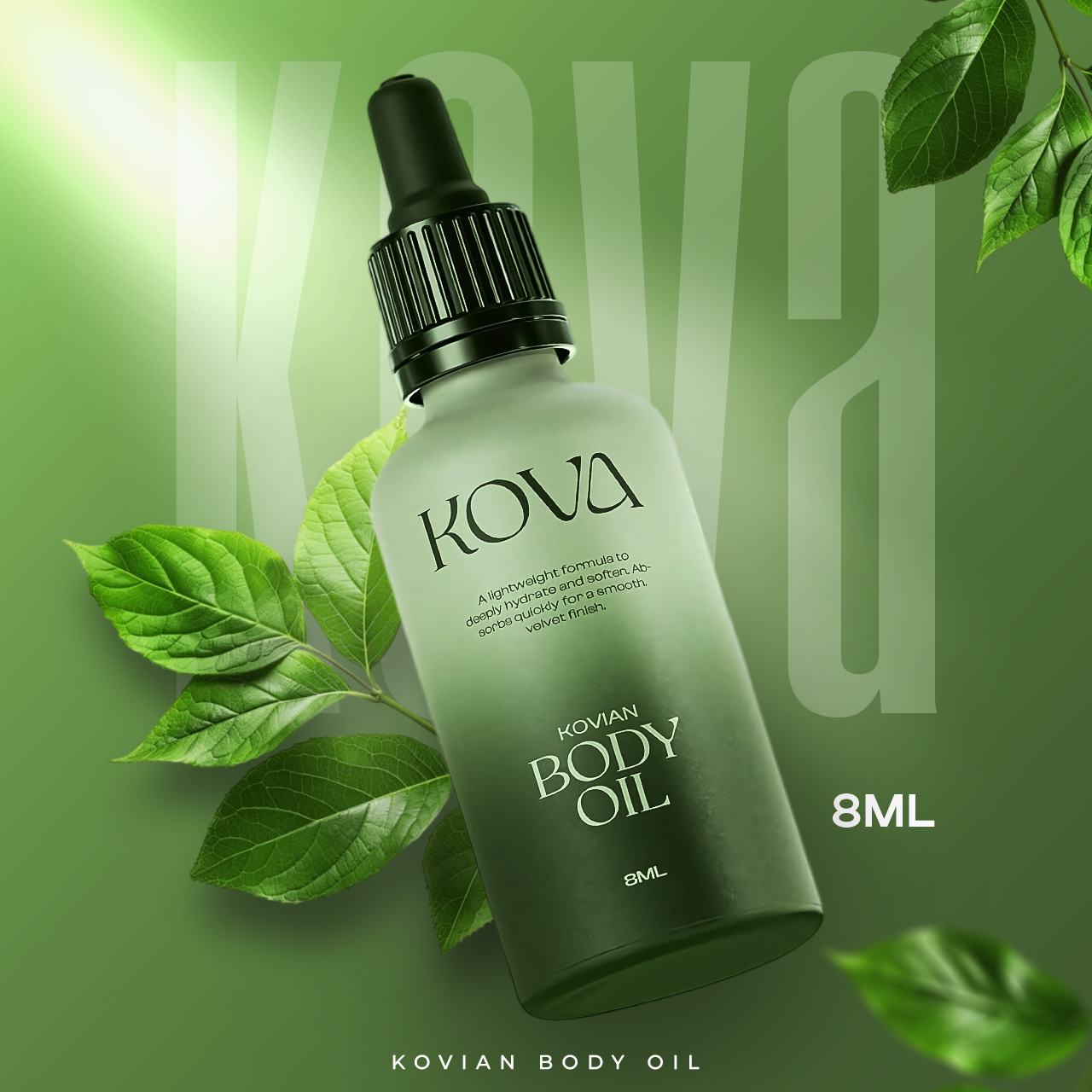
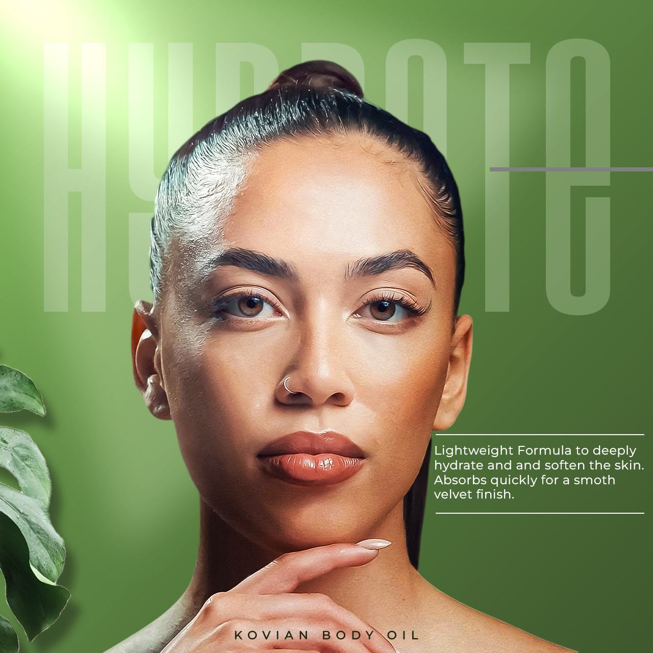
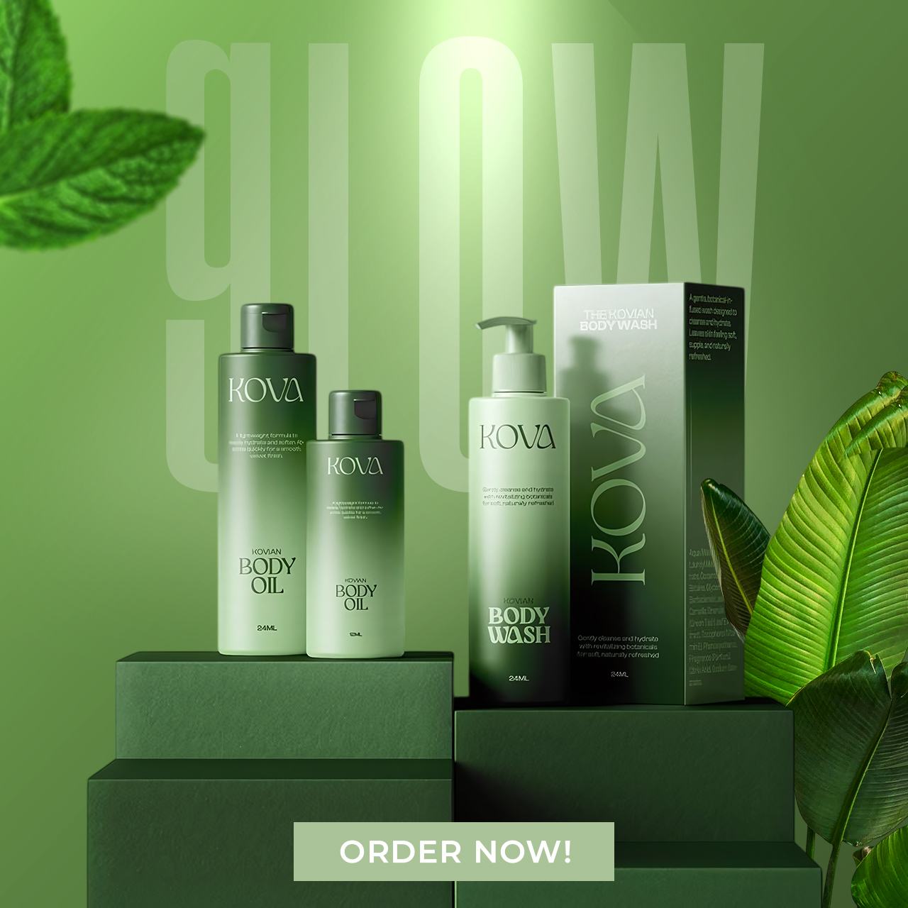
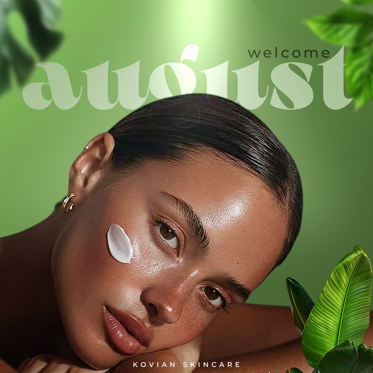
Kova Skincare wanted something elegant and minimal that still looked expensive — and unmistakably organic, since that's the core of the product.
Stripped the layout back to let whitespace and clean typography carry the premium feel, while natural tones and product imagery kept the organic promise front and centre.
A minimal, expensive-looking visual set that stays true to the brand's organic positioning.
Tell me about your brand and what you need — I'll get back to you.
Start a project